TNA #REBOOTED Section05- PPVs and SuperShows
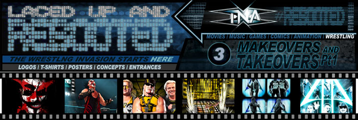
With all the Logos, Features, Main Players and Objectives in place over the TNA#Rebooted Sections, here is where everything comes into play in this, the Big Reboot Finale. So I present to you my whole Design take on how I would Present and Restructure the big Pay-Per-View TNA Shows, #Rebooted Style!

PPVs  and Supershows
Now at present, TNA broadcasts a total of 12 Pay-Per-View shows a year, and out of this the Big 4 PPVs are; Genesis, Lockdown, Slammiversary and Bound for Glory.
So for this version of the PPV yearly schedule, I’m going to keep with the Big 4, as well as add into the mix DestinationX, as this one really captures the unique qualities of TNA. As for the rest of the card, I’m turning the remaining PPVs into a style of Supershows, or as I’m going to rename them; MainEvent Shows.
Now these MainEvent Shows will run with the same formula as a PPV in terms of Title defences and longer running matches, but with the big difference being they’ll be aired on FreeTV (with commercials) as 3 hour long Impact Specials.
The idea or argument for this Supershow concept is in response to poor PPV sales (in all wrestling companies) and evidence of less emphasis or attention given to marketing these smaller shows. With the new format in place, there would be a much smoother transition between the house shows to the specials (aired at the same TV time), giving viewers a better chance to see the rivalry conclusions and therefore follow the developments easier. So with more viewers able to come onboard with the weekly Impact and MainEvent Shows, the build for the big Pay-Per-Views can be given more Time, Energy and Attention for major Advertising and Marketing.

Designs & Layouts
So before I go into more detail on the PPVs and Specials, firstly here’re the main Logo Designs for the 2 main types of shows. And for Design purposes, I’ve themed the PPVs in Gold and the MainEventShows in Silver, while keeping with the full titled TNA Impact Wrestling Logo:
These colour schemes will be themed into the Posters, DVDs and PPV/MainEvent Shows, to completely give each event its own Identity and Recognition.

Rebooted TNA PPV/MainEvent Show
So to continue on with giving some Identity to each event, I’ve added a few new Names and Themes to the MainEvent Shows. The object here is to give each one a distinct feel and make each one more Memorable and Standout, as well as presenting the titles in a fresh and modern style.
So with that said, here’s a Preview and rundown of the New Year in TNA:
Booking the Shows
To add a spot of Realism to this Section, I’ve made an attempt to add the Matchups and Booking decisions. Now the whole point to this presentation really isn’t about the booking (I’ll leave that to the bigger boys), but I’ve given it some thought and tried to add some logic and reason to the lineups as far as the roster goes. (Though please Note; due to some recent changes, some matches may no longer be possible- although I’ve scheduled this for 2013, so it could definitely still happen!).    
Extra Notes:
I’ve nicknamed the X-Division the X-D or X-D Title, simply for design purposes.
I’ve given the TV-Title a more prestigious role as in filling the gap that lies between the X-D and World Title. The idea here is that anyone in or around these titles has the chance to compete for the TV-Title. Plus the Title is defended frequently on house-shows (at least twice monthly) and if held for a worthy amount of time, can give the holder a World Title shot if traded in (much like the Money in the Bank briefcase).

So with all said and done, I hope you enjoy the Show!


1. GENESIS 01.13.13 (PPV)
The Concept: The mechanics of the Genesis Pay-Per-View will act out much the same as before, being a straightforward event with all the Championships on the line , but with the angle of all-new rivalries and feuds given their first big staging; A New Year and a New Direction!

The Setup: (Following on from the end of the years 2012 Impact Show) Since Hogan’s latest fall from grace; Exposed on record as using doctored fan-film footage in an attempt to cause friction amongst the ranks and gain full control, with the help of his old partner Eric Bischoff. Dixie Carter finally steps in and hands the GM position back to Sting.
The TNA World Championship is still held by Jeff Hardy, since beating Bobbie Roode at BFG2012. After his ill-fated attempts at regaining the Title from Roode during last years battles, James Storm steps up once more in his final shot at Gold.
Matches & Results:
TNA World Title Match- (c)Hardy vs Storm. Winner- James Storm
X-D 4-Way Title Match- (c)Aries vs Kash vs Ion vs Silva. Winner- Austin Aries
TagTeam Title Match- (c)JMRGKU vs MCMGs. Winners- MCMGs
TV-Title Match- (c)Styles vs Bully. Winner- Bully Ray


TNA #REBOOTED Section04 – Makeovers & Takeovers Pt2- TagTeams
For this Makeover edition of Rebooted I’ll be covering the Tagteams; a division in TNA that has really stood out as probably the best in the Wrestling Industry in recent years.
Now on completion of designing this Section, every Tagteam and member of each was still active in TNA, but due to recent roster changes, a number of these teams are no longer active at present. But since I’m booking these teams as a future concept (see Section5- PPVs) I’m staying firm to my choice, so hopefully we’ll see this lineup of Tagteams again sometime soon in TNA.   


4.1 MotorCityMachineGuns
As a massive Fan of the Machineguns, this Tagteam for me has been the best ever in Wrestling period (IMO ok!). While treading water for years in TNA, they finally reached their ultimate potential when gaining the belts and feuding with BeerMoney, in a series of matches that really tipped the scales of Tagteam Greatness. 
And while this team is no longer active in TNA, I’m sure we’ll be seeing a lot more of the MotorCityMachineGuns in the future.

As for the appearance and style of these guys, I wouldn’t change a thing, so for this Makeover I’m simply going to expand upon the package, with a new Logo and extra Elements to compliment the overall Presentation:
For the main Logo I’ve given a hint of a Nascar theme, with chequered strips and tire marks.
And as for the main MCMGs’ Icon, here’s introducing the Transformer nascar/robot known only as MachineHead. It would be great to incorporate the MachineHead character into the MCMG concept; maybe with a full scale model to appear in promos or incorporated into the entrance theme.

To present the whole Package, with the Wrestlers and Logos and a new team Tagline, here’s the Promo Poster:
And to go with the ‘Greatest Wrestler’ tagline trend, ‘The Fastest Team on Earth’ I feel fits in nicely with this team.

So using all the Logos and Props for the MCMGs package so far, here’s the new T-shirt:

To add to the MCMGs theme even further and expand upon the Image and Hype, as well as the Lineup, here’s a Special Promotions Poster for the Next Generation of the Fastest Team on Earth and the Future of the MoterCityMachineGuns:
Now this setup I’d love to see; with the One Girl Revolution that is Taeler Hendrix and the MachineGuns together: A Dreamteam if ever there was one!
And unless you’ve been totally distracted by the foreground, you may have noticed the MCMG Nascars at either side. This is a theme I’d love to see played out at a huge PPV; Imagine the Guns driving down to ringside at BFG for their Big Future Return! (please let there be a MCMGs Future!!) 


TNA #REBOOTED Section03– Makeovers & Takeovers Pt1- Legends
With the overall Visuals for the weekly Impact shows covered in the first TNA Sections, it’s time to take a look at certain individual Wrestlers, as well as Factions and Tagteams (in part 2).
And as with designing the first Sections of this article, the same attention to detail and consistency for Colour schemes, Icons and Styles applies here, especially when dealing with Factions and Tagteams.

So in this Section I’m going to take a short rewind in recent TNA history, to look at how I would have personally presented some of the legendary characters from the past years.
Now I first produced the designs for this Section at a time when these particular Legend scenarios were still active, but I decided to keep them included to give the whole TNA Reboot article some back story, and for when I arrive at the Pay-Per-Views (see Section05).
Now in most cases I’ve never been a great fan of seeing the older Stars actually wrestling in matches, especially when they appear to be far less convincing in the ring, but I still believe that when Representing and Promoting the younger talent, or to give recognition to the company as a Marketing Tool, this can be only be a Bonus!
So here we go with some of the biggest Legends of Wrestling- Rebooted!   


3.1 Sting
Sting has the look and image that I’ve always felt really fits in with TNA, and although he’s put on some great matches within the company over the years (& still can), the role that I found was a surprisingly good fit in recent months was as the show’s General Manager.
For this Reboot version of Sting though, I’m going to take it to the era of his rivalry with Immortal, as he made his return with the crazed and unstable persona as the Insane Icon. But instead of the Joker-style look, I’m going to add a little more aggression, with a darker image that could almost tip the character over as appearing heel-like.

So first off, I’ve altered the Name and Logo of The Icon Sting, to the new title of; Stinger X ‘The Twisted Icon’, to fit into the style and attitude of this new makeover:
The Logo is similar in design to Sting’s familiar style, though I’ve expanded on it to make for a smooth transition into the next incarnation.

And here is the new ‘Twisted’ Stinger in the flesh, with the ‘X’ taking the shape of a bloody smear of war-paint across his face:
Now for this new version of the Icon, I still envision him to take on a similar ‘Insane’ role of acting, but probably to be a little more subdued and calculated than the clown-like character played recently. I can imagine the new Stinger to be more inclined to take the violence to a fight and act with more aggression when pushed, getting the job done by any means necessary, rather than play by the face rules.  

And to capture the new StingerX Style, here’s the new Dark and ‘Twisted’ T-shirt:
‘Why so Nervous?’ is beginning to sound like an Understatement.

And to further Illustrate the new look, here’s the Twisted Icon in action, striking Fear into all that face him:
The Outfit is pretty much the same as Sting’s original one, just with the ‘X’ emblazoned down the sides and extra padding and bandages wrapping the arms. I’ve also continued the blood smears over his chest to give a more unhinged feel.

And finally onto Stinger’s Entrance theme as ‘The Twisted Icon’.
This is pretty much the classic Sting intro as we’ve come to expect over the years, just with the new Logos and Icons added to the new look TNA Entrance Ramp.
With the lights down low and the red smoke rising, here comes the Stinger:
Be Afraid, be very Afraid, as the Stinger emerges from the smoke, wearing a blood-stained overcoat and an Evil, Sadistic Smile- WOOO!  


TNA #REBOOTED Section02- Titles with Impact
To continue on from the Logos Section (1) and to wrap up the Graphics for the Weekly Impact shows, I'm going to tackle the visuals for the main Title Sequence to open up the show.
So putting some Storyboard action into play, I've put together a set of photo panels to illustrate how the sequence will run.

Now looking through the opening titles to most Wrestling shows (past or present), apart from the music and logos standing out, the sequences usually consists of cropped footage of characters, moves and slams, cut together at a fast pace, with a few explosions in for good measure. 
And while this does its job in presenting the contents to the show, I wanted to add a level of design to make the visuals really stand out and give the show an identity that would be memorable and instantly recognisable.  

So in order to attempt in capturing the feel of Impact and its target demography, and to make Impact look fresh, exciting and in touch with its audience, I've produced a Title scenario that fits together all the Logos, Colour Schemes and Props, while still keeping the clips of the actual show’s events.

Titles with Style 
Ok,so the basic premise is as follows:
A gang of street Artists, laden with spray cans and paint, take to the outer walls of the Impact Zone. They set to work spraying, tagging and fly-posting the entire area with giant-sized Wrestlers and Logos, while the paintings begin to come to life as they work. The huge characters move into action, smashing, grappling and slamming each other and everything in sight as the area becomes a stomping ground of wrestling action. As the gang work on regardless, the whole scene comes together, revealing the huge action packed TNA Impact Wrestling logo.   

Title Mechanics
To begin this, I’d have the gang breaking thru the black and white tape (theme continuation from logo), then have them sped up in super fast motion as they put the characters together at breakneck speeds. The paintings would then interact with foreground objects, knocking over cans and ladders, bending signposts and cutting through tape, whilst playing out actual scenarios from clips of the show; Poses, Celebrations and high-impact Moves.

So take a look and you’ll get the idea- But just before you do, to set the scene properly and get more of the style and feel of the sequence, here's my suggestion; 
Title Music of choice in my opinion would have to be-
Beastie Boys ‘Lee Majors Come Again’ from the album- HotSauceCommiteePt2.
Here's the Youtube link- just click HERE
So get the whole Experience and Play it Loud, Scroll on down and Enjoy...


Title Mechanics (cont)
And on the Sequence goes- From this point at the Impact Logo I’d go straight into the live action show, fading the title Logo in with a birds-eye shot of the ring with the logo emblazoned in its centre. The camera then sweeps up to a shot of the Entrance ramp (music still playing), with pyros and lights flashing as the ring announce team walk down the ramp towards the ring. With a welcome from the commentary team it’s on with the show (see Section1-ImpactZone). 

So there's my attempt in creating a fresh introduction to the show, bringing the whole Impact image up to date and relevant to today's pop-culture audience.  
And that about wraps it up for the TNA Impact Wrestling house show Sections. Thanks for viewing the show so far and stay tuned for what's just around the corner in Sections 3 & 4- Makeovers and Takeovers, where I take the Reboot to the Roster. See you there!


TNA #REBOOTED Section01- Logos with Impact
Welcome to the first in a series of Laced Up & Rebooted sections, covering the Total Non-Stop Action Wrestling company that is TNA and Impact Wrestling.

TNA Impact Wrestling
Ever since TNA first caught my eye on the Impact shows and PPVs, back in 2005, with its spectacular highflying X-Division, fast paced matches and brutal hardcore action, I’ve been an avid follower and big fan of the show.
When I first tuned in, I was amazed by the sheer wrestling abilities of these new wrestlers such as AJ Styles, Samoa Joe, Chris Sabin and many others, plus the spectacle of the six-sided-ring, adding further intrigue to this new and exciting wrestling show.
Over the years, with various production and roster changes, there have been many high points as well as lows, but overall I believe that as a growing company, TNA have contributed some impressive and lasting achievements to the industry, giving healthy competition to the overall scene.
And despite some of the obvious flaws within TNA, when it comes to the actual wrestling and in-ring action, with one of the best rosters of talent in the business, TNA has a real knack of delivering some of the greatest quality Wrestling seen on TV.

The Marketing Machine
Now as a fan of a number of wrestling companies over the years, I have to agree that the WWE still manages to far outweigh the competition when it comes to Marketing their product. Whether it be Presentation, Advertising or good old-fashioned Hype, it’s a huge and daunting task for any company, wrestling or otherwise, to compete on the level of the big WWE Machine. 
And this is where I believe TNA really need to concentrate all of their energies towards, in order to compete and survive as a top contender to the No1 Wrestling Company.

Mission Statement
So what I'm aiming to achieve in these TNA sections is- Taking props and experience as a designer in producing new concepts and ideas for products, hypothetically speaking, if I was given the design brief to build up the marketing side of TNA; presenting the production package of the company from the ground up, well this is how I would go about doing it...

1.1 Logos
Starting with the design basics at the front-end of the Impact Show product, I’m going to cover the main Logos. 
Now the first point I’m going to make is with the show’s Title and the confusion with using both TNA and Impact Wrestling separately. To avoid this I’m simply going to combine the 2 together from here on in, to make it ‘TNA Impact Wrestling’. This Title will also be used when presenting Pay-Per-Views & Specials (see Section5).  

Now as the Impact Wrestling Logo stands, I really like the font and new colour schemes, but I still think it could be a little bolder in style for the subject matter of an Action-based product.  
So with this in mind, here is my first redesigned version of the TNA Impact Wrestling Logo:
While keeping with the current Impact fonts, I’ve tried to give the Logo a more defined and solid approach, with a stronger outline and metallic finish to give it some weight. I’ve used the old TNA design (out of preference to the new 1), just adding gloss and a few more spikes.  
As for the Tagline, which in it's current state reads 'Where Wrestling Matters', I've cut this down and incorporated it into the 'Wrestling' type to now just read, 'Where It Matters'- A little snappier and less laboured I'd say.

Here're a few more examples of the Logo against a variety of backgrounds:

Now to present the Logo as a Cover for DVDs and Posters etc, I’ve brought in some extra elements to create a combined wrestling feel, with movement and dynamics to make for an action-packed feel to the product:
To break the design down; I’ve used the movie Clapper-board B&W stripes to signify ‘Action’ (a theme implemented into other areas of the show) along with current wresters from the roster to instantly define a wrestling theme.
This Design will also be used as the main Titles to the show (see Section2).    


FXTVE #REBOOTED Section00– Marching Foreword
The Graphic Invasion Starts Here!
Hi everyone and Welcome to FXTVE-Rebooted; The Fan-Art Site where I take on the World of Entertainment from an Artists Perspective. From here I’ll be giving my own Design interpretations of the Pop-Culture products I’ve grown up with and been drawn to over the years, from Movies and Music to Sports, Comics and Games.  
So as a professional Designer in the field of Graphics, Illustration and Animation, I will be using this channel to Showcase and Promote my Ideas, Artwork and Concepts, while giving my own Alternate take on the products that I admire and appreciate the most as a Fan. 

And with that said, it’s time to start Rebooting! So here’s what’s coming up in the following Sections of FXTVE-Rebooted:

Sports Entertainment
As a huge fan of the Sports Entertainment industry, I will be covering quite a number of subjects on the World of Professional Wrestling, so lace up your boots and get ready for a brawl:  

Laced Up & Rebooted will take on the task of covering many aspects of Design within Pro-Wrestling, from Presentation and Marketing angles, to new Ideas and Concepts. With Logos, Posters, Characters and more, this will be my attempt to rebuild and create a fresh and modern approach to the Wrestling business.
The Monstars of Wrestling PPV Specials; An Alien Invasion is coming in the form of a Cartoon Wrestling World known as the M.o.W. These guys may look familiar, but be warned; they've all embraced their Monstars within!  
That’s Entertainment!
And before you say it, there's a lot more besides Wrestling on its way, I promise!
Here's a taste of what's to come from the ever expanding Reboot files:

Further Entertainment Sections will feature Concepts, Characters & Designs, covering the Art of Movies, Music, Animation, Comics and Video-Games, Redesigned & #Rebooted.  
From the biggest Blockbusters to the Indie Classics, there will be Sci-Fi, Action, Superheroes, Horror and much much more, all Designed and Rebooted to bring out the Nostalgia and Nerdiness in everyone.
Sections included are: The Big Picture Rebooted, Tuned in and Rebooted, and Shutdown and Rebooted.
Scary Monstars & Super FreaX is a showcase of super-sized, insanely detailed & frighteningly realistic Caricatures. A macabre mix of legendary Stars from the world of Movies, Music & Wrestling, all with a Monster twist; Larger than life & much Scarier in the Flesh!


So from FreaxTVchannelE (aka RAWhale) I hope you enjoy this Fan-Art Site.
Please feel free to add your comments, suggestions or ideas to the upcoming Sections; As long as it’s Creative, Constructive or just plain Complimentary, it’ll be Welcome ;)
You can also follow me on Twitter @freaxtvchannele for updates & comments, or email me at freaxtvchannele@hotmail.co.uk . I look forward to hearing from you!
Oh & just one more thing: Please Ask permission before using any of the images. Thanks!